Description: Describing the usefulness and effects the different colors have on websites and businesses.
Connecting with Colors
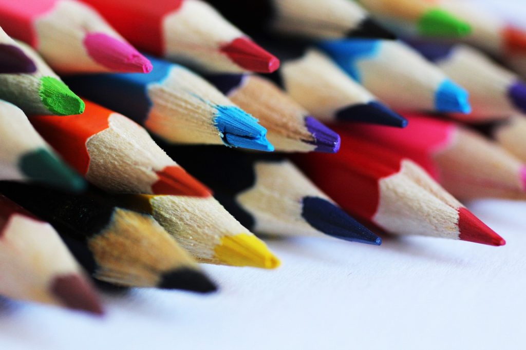
Colors play a huge role in website design, some designers (such as myself) find the theory and usage of hues to be confusing and all-around frustrating. Many people don’t realize it, but colors play a huge role in your subconscious decisions and biases; sometimes, the reaction you get from a badly colored website is so visceral, that the decision to click off the website is quite conscious.
Color Theory
Color theory is the secret ingredient that all good websites add to their recipes, turning boring posts and pages into visually appealing sites with eye-catching designs. Understanding how colors work together, and which colors evoke the feelings and reactions you want from a user, can drastically improve the effectiveness of your website. Image this: you are on TikTok or Instagram, bored out of your mind, scrolling aimlessly when suddenly you see certain posts that stand out from the rest. It’s their clever use of color that grabs your attention, even if the actual content of the posts isn’t to your liking. While I certainly am not the one to explain the in-depth color theory and all its nitty-gritty details, I can certainly help by giving you a rundown of all the colors of the rainbow and the effects they have on people. Understand though, that just like with anything, subtly works best. Too much of a color just looks unprofessional and it loses the subconscious effect it has on users.
Red:
Red is extremely energy-packed and attention-seeking, and more often than not, people only associate red with either love or anger. In the web design industry, however, red gets to play a few different roles. Just like how a red-painted car gives off the feeling of power and a red sign commands you to stop, red used in websites is typically used in CTAs, or calls to action. Red demands attention and provokes users to click important links and buttons. It also can raise an appetite, hence why you see famous food brands like Chick-fil-A and McDonald’s use red in their logo.
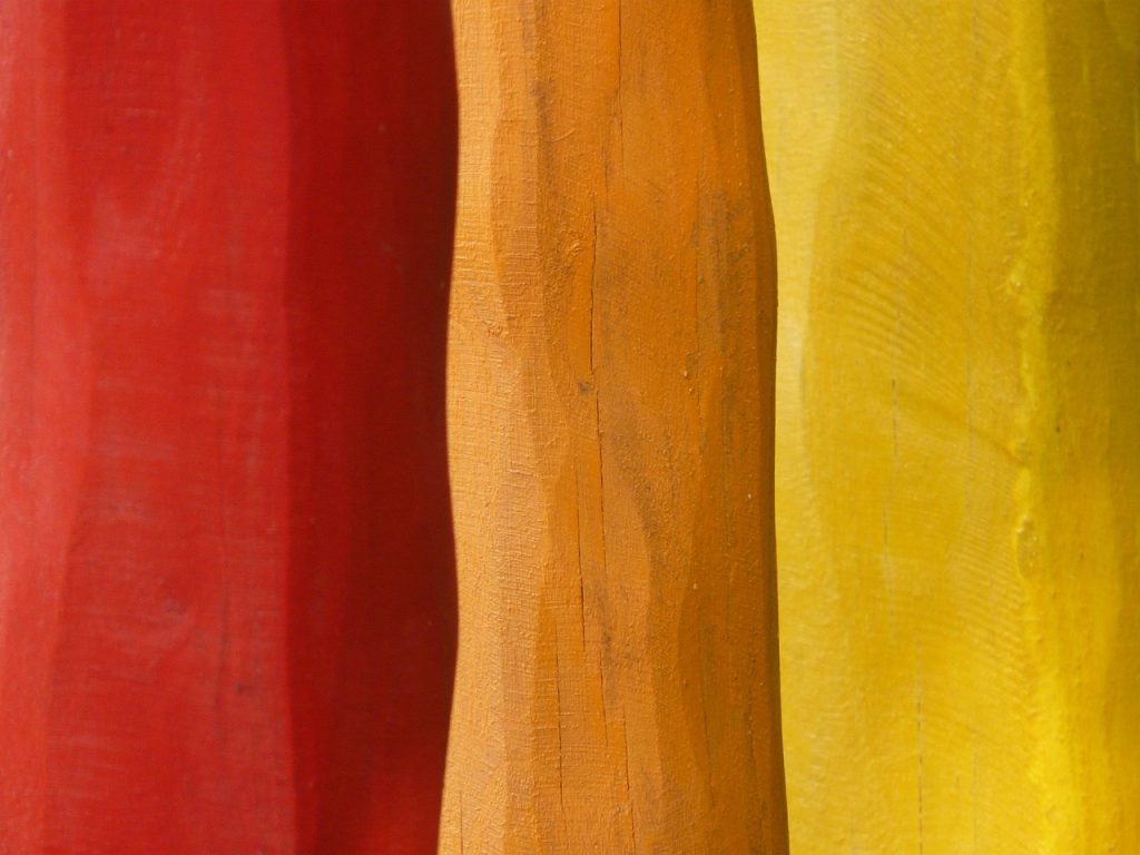
Orange:
Similar to red, orange is used often to elicit an appetite from people. You often see orange used to most in restaurants and fast-food places, the most famous being Popeye’s, Burger King, and In-and-Out. Orange is also energetic, albeit less than red, and is still often used for CTAs because of its vibrance and joy. Orange is associated with friendliness and, surprisingly, creativity, making it a highly used hue for tech brands and art stores.
Yellow:
Yellow’s role in web design doesn’t change much from how it’s used in other aspects of life. It is sunshine and happiness when used in correct proportions, making users feel happy, relieved, and refreshed. Like every other energetic hue, yellow brings attention to links and prompts the users to action. It’s the perfect choice if you want to create a vibrant and memorable user experience.
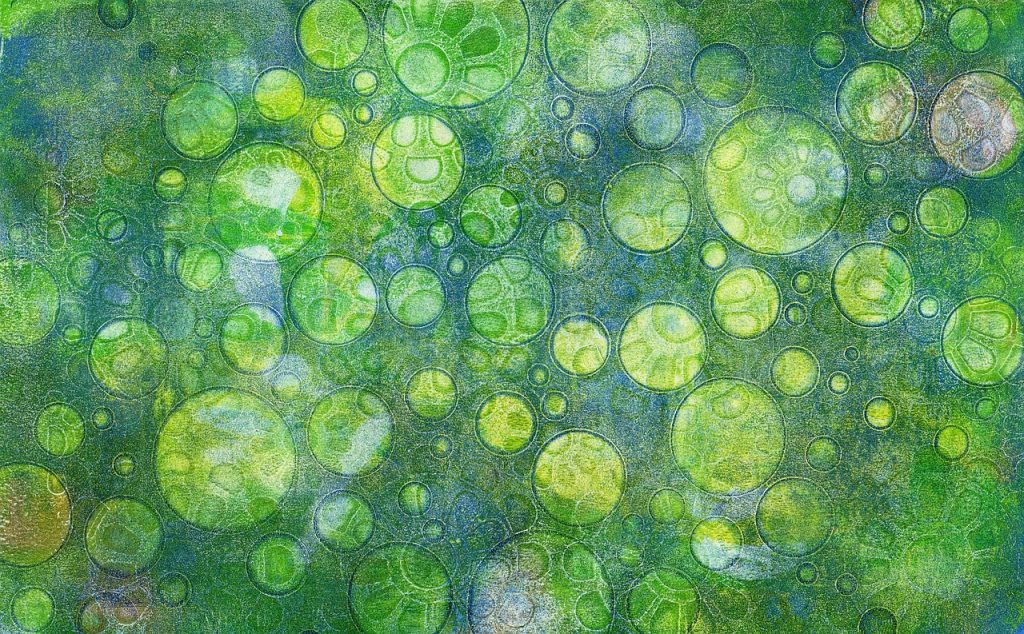
Green:
Psychologically, green is known to have a calming effect, bringing one closer to nature and its fresh greenery. In almost every nature website you have ever seen, green has been used; one, for the obvious connection green has to nature, and two, because green rejuvenates, making the users feel calmer. A green palette can help your website stand out and create a visually appealing experience for your visitors.
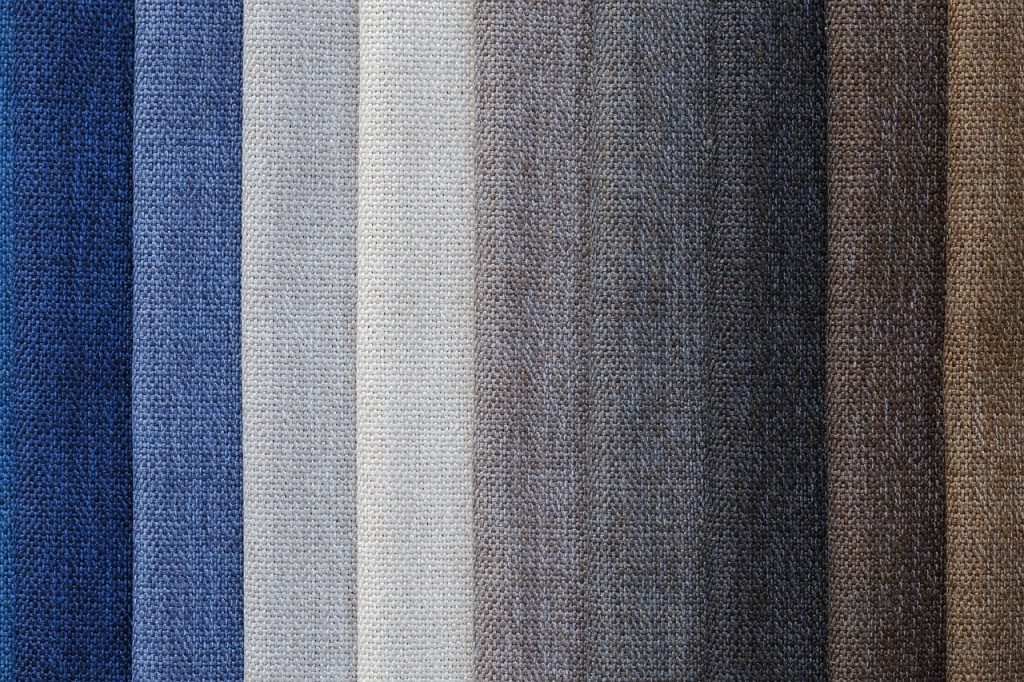
Blue:
Blue is calming, soothing, and friendly. It’s often a fail-safe, neutral choice and can take on a professional or friendly tone, depending on how you use it. Many banks use blue because of the fact it makes them seem more trustworthy while still keeping themselves professional. Blue is also seen as a sign of stability and reliability. Businesses that want to project an image of security often utilize blue in their advertising and marketing efforts.
Purple:
Purple is versatile, having the trustworthiness of blue and the attention-grabbing ability of red, purple can convey a range of emotions and meanings in web design. It’s often associated with creativity, luxury, and spirituality. Using a purple palette can help your website stand out and create a unique, memorable experience for your visitors.
Specific Color Trends
Netrual is Cool
With a blast from the past, colors, even though I just a lot of time breaking them down, are being pushed off to the side so that designers can embrace the new neutral color trend. Often paired with soft, cozy textures and minimalist design, luxurious neutrals suit brands that want to convey cutting-edge sophistication and effortless elegance. In 2024, neutrals will be trendy, elevated, and modern.
Colbat Blue
This versatile shade can be ultra-modern or retro, depending on how you use it. Pair it with its complementary color, Yellow, for a nostalgic look, or use it as a solitary statement for a contemporary effect. Not liking the power of this electric color? For a more subtle use of this electric hue, reserve Cobalt Blue for pops of color on buttons.